Designing, prototyping, collaborating with impact.
🎨
🎨
Crafting clear, engaging interfaces that guide users effortlessly through every journey.
⚡
⚡
Rapid prototyping that turns ideas into testable, validated solutions with real impact.
🤝
🤝
Collaborative design that bridges teams, aligning user needs with business goals.
SELECTED WORKS
01
QUT Online
UX/UI Design
Led the website redesign to support lead generation and improve the user experience of the QUT Online learning platform following the brand refresh. Designs were informed by user research and CRO testing, resulting in responsive, accessible web pages and an interactive course guide brochure.
Delivered at OES. Credit to Ethan Yu and Molly Seeary. Selected screens are shown due to client confidentiality. Further details can be shared upon request.


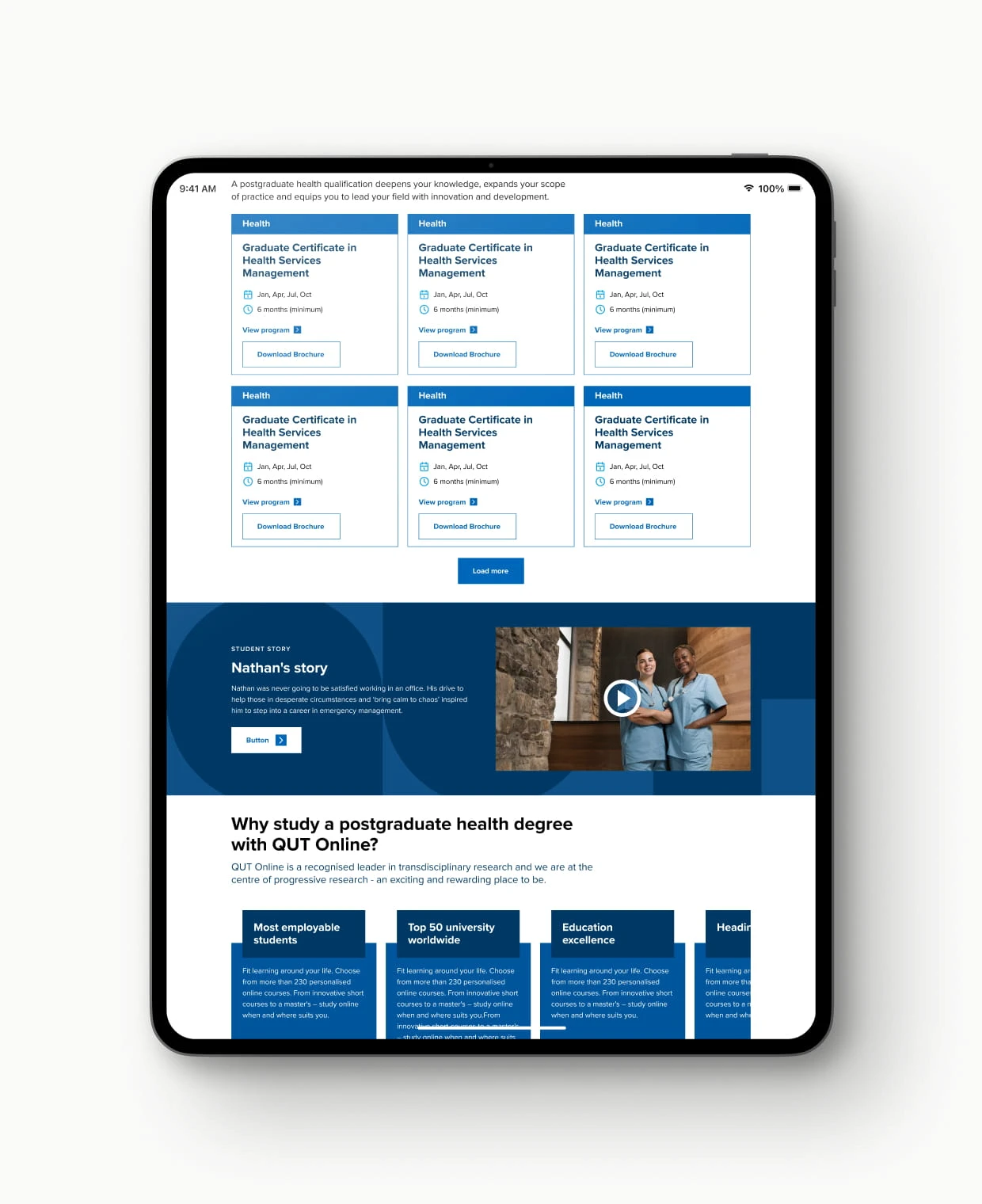
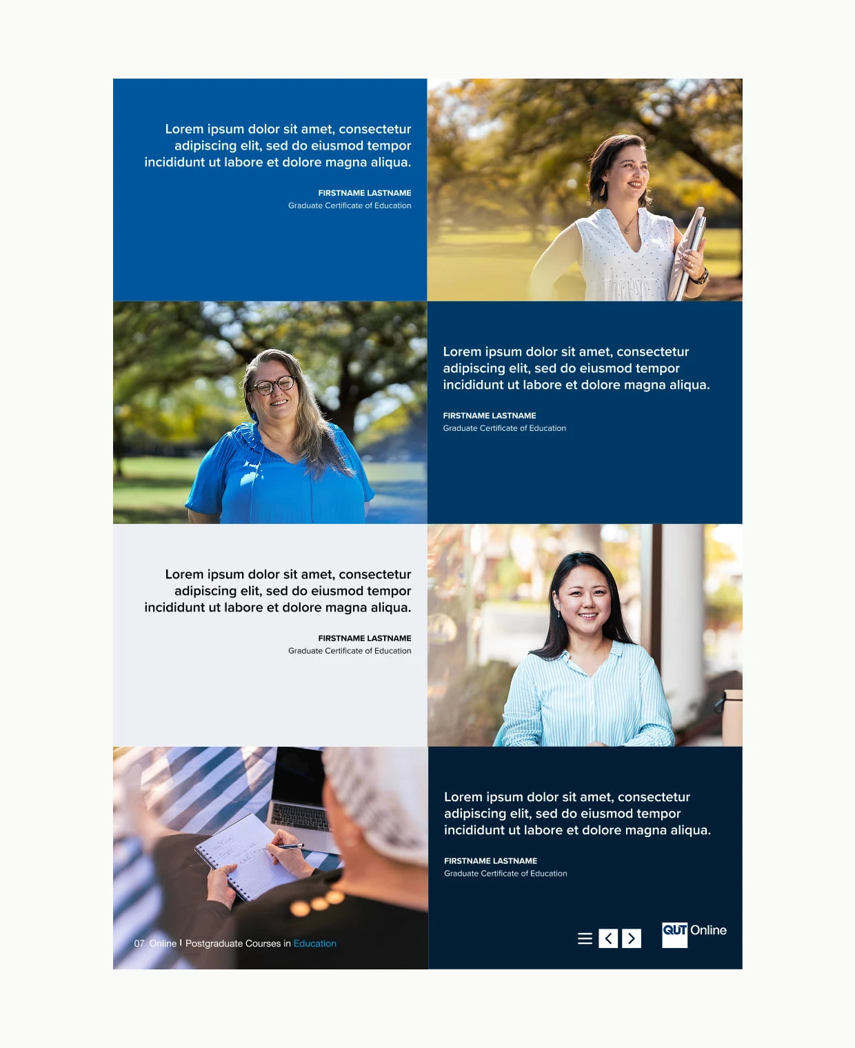
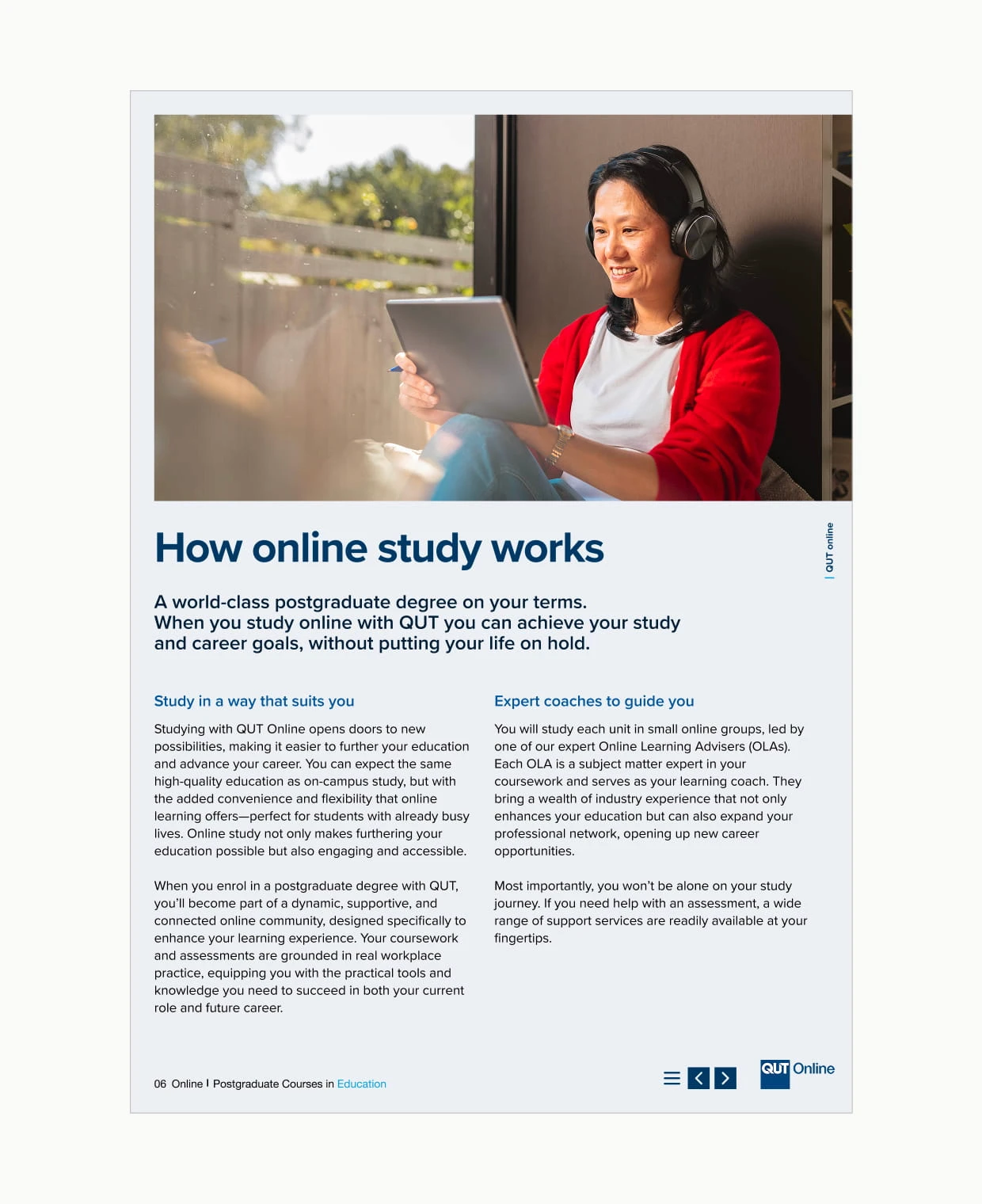
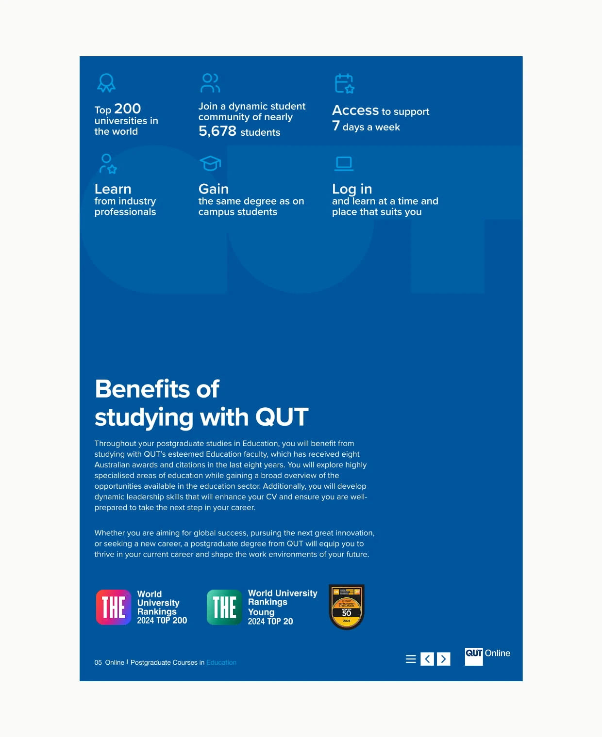
The new QUT Online site launched on schedule, benefiting from a well-prepared design library and consistent assets. Early user feedback indicated an improved experience, leading to increased engagement, higher lead conversions, and a stronger position in the competitive online learning space.
01
QUT Online
UX/UI Design
Led the website redesign to support lead generation and improve the user experience of the QUT Online learning platform following the brand refresh. Designs were informed by user research and CRO testing, resulting in responsive, accessible web pages and an interactive course guide brochure.
Delivered at OES. Credit to Ethan Yu and Molly Seeary. Selected screens are shown due to client confidentiality. Further details can be shared upon request.
The new QUT Online site launched on schedule, benefiting from a well-prepared design library and consistent assets. Early user feedback indicated an improved experience, leading to increased engagement, higher lead conversions, and a stronger position in the competitive online learning space.
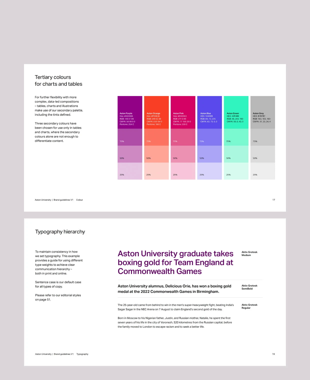
02
Aston University Online
UX/UI Design
Delivered a website redesign in collaboration with the university’s branding team to align the digital experience with the new brand identity. The project included redesigning existing content, building reusable design library assets, and conducting QA testing after delivery.
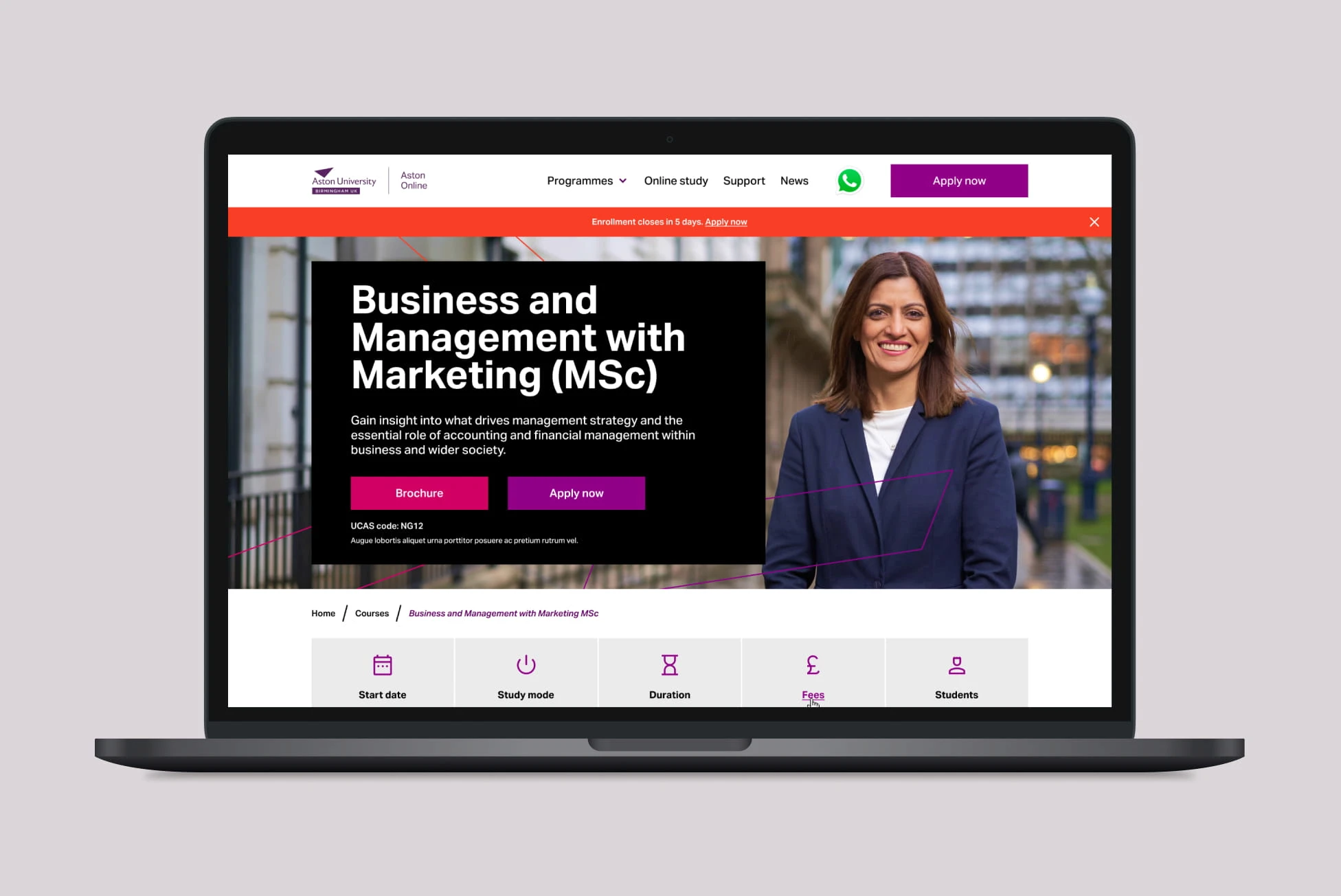
Delivered at OES. Selected screens are shown due to client confidentiality. Further details can be shared upon request.


The Aston Online platform was successfully redesigned and launched on schedule, aligning with stakeholder expectations and receiving full approval from the UK-based design team. The refreshed design opened up new opportunities for targeted marketing, improved user engagement, and increased conversion rates—strengthening Aston University’s presence across both its on-campus and online education offerings.
02
Aston University Online
UX/UI Design
Delivered a website redesign in collaboration with the university’s branding team to align the digital experience with the new brand identity. The project included redesigning existing content, building reusable design library assets, and conducting QA testing after delivery.
Delivered at OES. Selected screens are shown due to client confidentiality. Further details can be shared upon request.
The Aston Online platform was successfully redesigned and launched on schedule, aligning with stakeholder expectations and receiving full approval from the UK-based design team. The refreshed design opened up new opportunities for targeted marketing, improved user engagement, and increased conversion rates—strengthening Aston University’s presence across both its on-campus and online education offerings.
03
Monash University Online
UX/UI Design
Supported ongoing UX and UI improvements across key website sections for Monash Online. CRO insights and usability testing informed new interface initiatives, while global components and patterns were refined through the development of a functional design library.
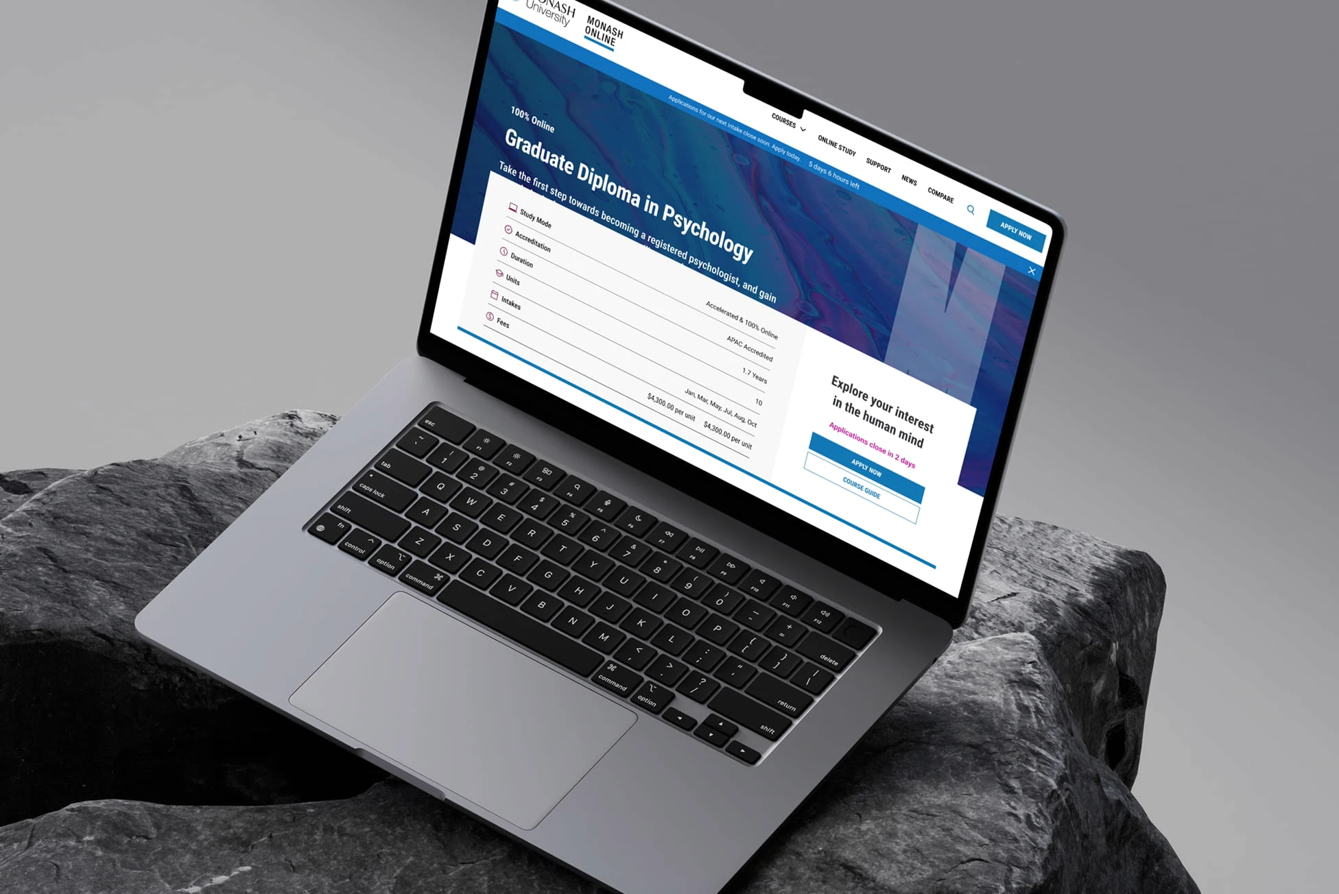
Delivered at OES. Credit to Ethan Yu & Molly Seeary. Selected screens shown due to client confidentiality. Further details can be shared upon request.


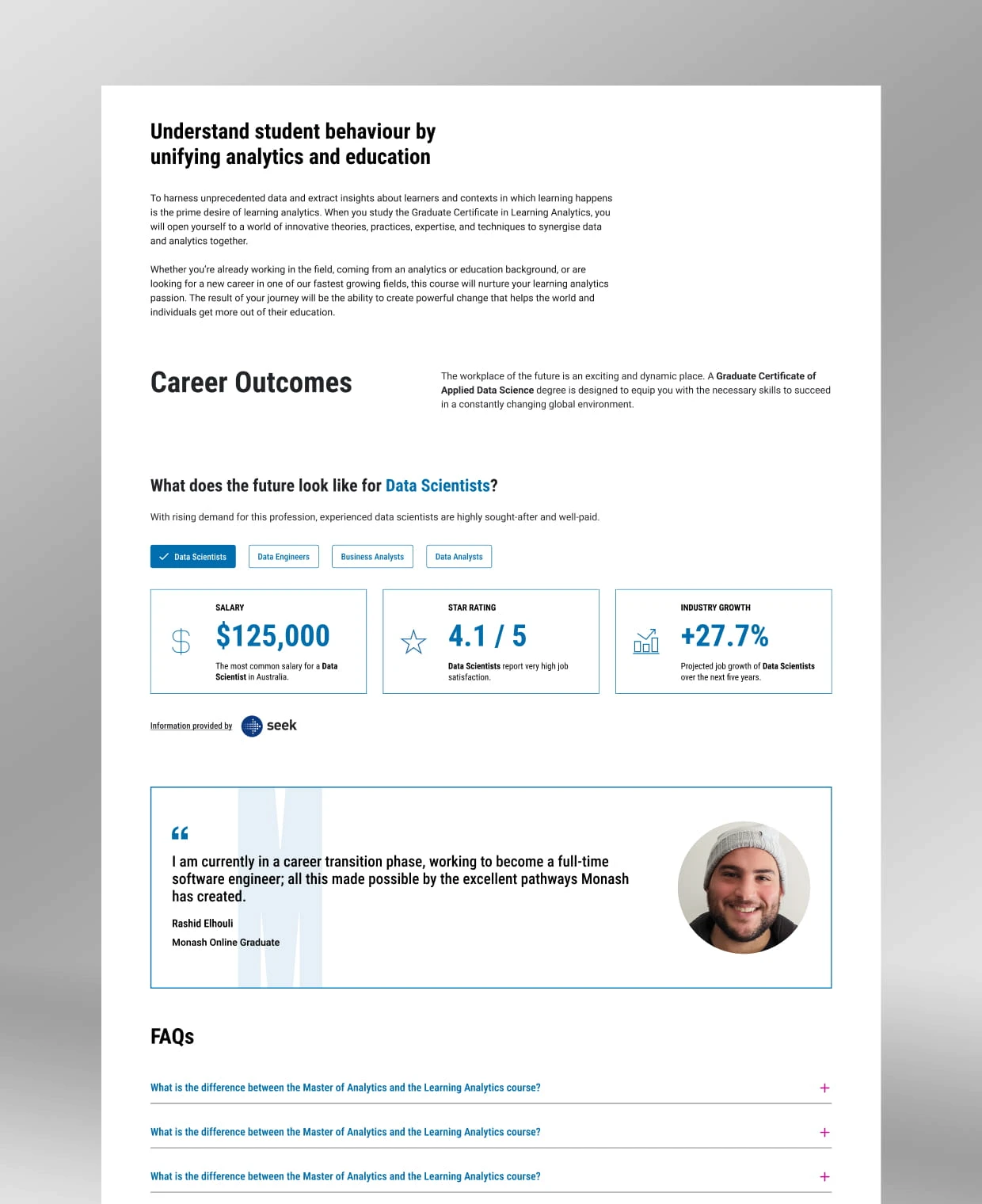
The revamped Monash Online platform now features a visually consistent and standardised design, resulting in a significant increase in student registrations and expressions of interest in online education. From a business perspective, the improved page designs led to a notable increase in conversion rates, particularly validated through positive user testing feedback.
03
Monash University Online
UX/UI Design
Supported ongoing UX and UI improvements across key website sections for Monash Online. CRO insights and usability testing informed new interface initiatives, while global components and patterns were refined through the development of a functional design library.
Delivered at OES. Credit to Ethan Yu & Molly Seeary. Selected screens shown due to client confidentiality. Further details can be shared upon request.
The revamped Monash Online platform now features a visually consistent and standardised design, resulting in a significant increase in student registrations and expressions of interest in online education. From a business perspective, the improved page designs led to a notable increase in conversion rates, particularly validated through positive user testing feedback.
04
Federation University Online
UX/UI Design
Facilitated design workshops to translate new visual and digital guidelines into the website experience. Key homepage and course page modules were redesigned, and design foundations were updated to align with the refreshed digital style.

Delivered at OES. Credit to Ethan Yu & Molly Seeary. Selected screens shown due to client confidentiality. Further details can be shared upon request.
The redesign successfully transferred Federation University’s updated brand identity to the online platform. The refreshed designs not only ensured visual consistency across all touchpoints but also enhanced the platform’s appeal to prospective students and its effectiveness in supporting future marketing campaigns. Stakeholders were highly satisfied with the quick turnaround and impactful results, marking the project as a significant achievement for the Federation team.
04
Federation University Online
UX/UI Design
Facilitated design workshops to translate new visual and digital guidelines into the website experience. Key homepage and course page modules were redesigned, and design foundations were updated to align with the refreshed digital style.
Delivered at OES. Credit to Ethan Yu & Molly Seeary. Selected screens shown due to client confidentiality. Further details can be shared upon request.
The redesign successfully transferred Federation University’s updated brand identity to the online platform. The refreshed designs not only ensured visual consistency across all touchpoints but also enhanced the platform’s appeal to prospective students and its effectiveness in supporting future marketing campaigns. Stakeholders were highly satisfied with the quick turnaround and impactful results, marking the project as a significant achievement for the Federation team.
05
QV Product Brochures
Graphic Design
Designed product brochures for QV’s new product line, presenting key product information through clear layouts and strong visual hierarchy. The work followed established brand guidelines while accommodating client feedback and change requests, ensuring accurate version control and a smooth handover for production.

Selected screens are shown due to client confidentiality. Further details can be shared upon request. 2025.
Praesent bibendum a elit non efficitur. Etiam et velit vitae quam aliquet fermentum. Quisque sit amet nulla dictum, cursus erat a, tempus est. Sed laoreet, magna eget mattis tincidunt.Donec ornare urna metus, ut mollis risus dignissim in. Phasellus tristique sed leo et dignissim. Nam lobortis vitae leo at finibus. Aliquam eget 200 efficitur lacus. Quisque nunc nisi, dictum at sodales sed, ornare vel dolor. Sed rhoncus placerat ante rutrum condimentum. Fusce nunc sapien, sodales et consectetur at, sodales egestas lectus.
05
QV Product Brochures
Graphic Design
Designed product brochures for QV’s new product line, presenting key product information through clear layouts and strong visual hierarchy. The work followed established brand guidelines while accommodating client feedback and change requests, ensuring accurate version control and a smooth handover for production.
Selected screens are shown due to client confidentiality. Further details can be shared upon request. 2025.
Praesent bibendum a elit non efficitur. Etiam et velit vitae quam aliquet fermentum. Quisque sit amet nulla dictum, cursus erat a, tempus est. Sed laoreet, magna eget mattis tincidunt.Donec ornare urna metus, ut mollis risus dignissim in. Phasellus tristique sed leo et dignissim. Nam lobortis vitae leo at finibus. Aliquam eget 200 efficitur lacus. Quisque nunc nisi, dictum at sodales sed, ornare vel dolor. Sed rhoncus placerat ante rutrum condimentum. Fusce nunc sapien, sodales et consectetur at, sodales egestas lectus.
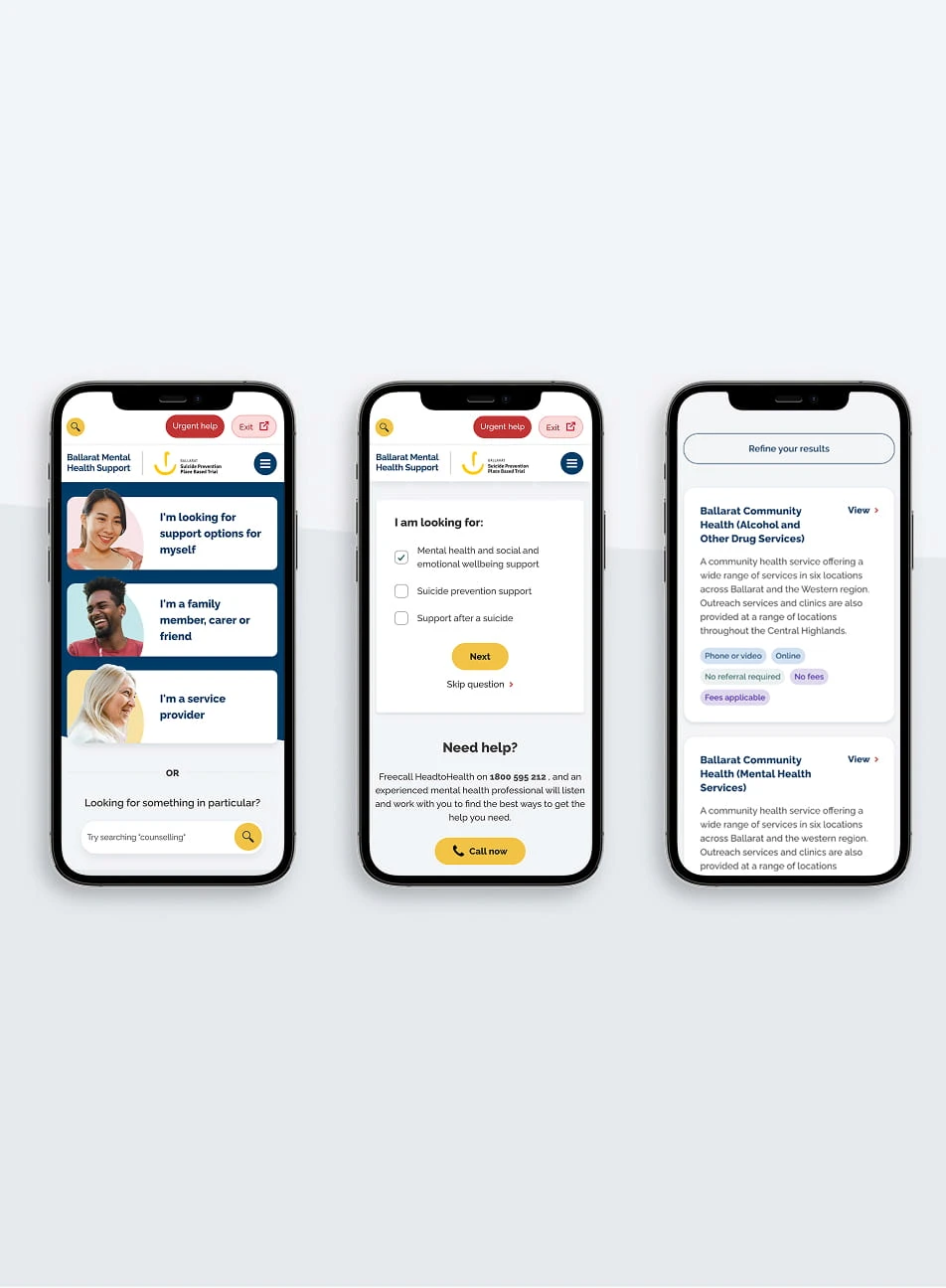
06
Hello Inspection
UX/UI Design
Facilitating discovery workshops with main stakeholders, planning and conducting activities needed to define the problem, developing working prototypes for testing and final UI designs.
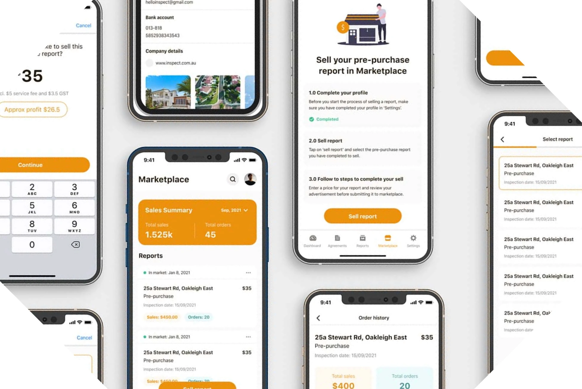
Credit to Eddie Liu. Selected screens are shown due to client confidentiality. Further details can be shared upon request. 2022.
The introduction of the marketplace brought noticeable improvements. The number of new users increased by 30%, with most engaging with the marketplace feature. Complaints about the app significantly dropped, and the drop-off rate decreased from 20% to 11%. Additionally, user satisfaction, as measured by NPS scores, saw an increase from 4.1 to 4.5. These results highlight the success of the marketplace in addressing user concerns and improving the app’s overall functionality and appeal.
06
Hello Inspection
UX/UI Design
Facilitating discovery workshops with main stakeholders, planning and conducting activities needed to define the problem, developing working prototypes for testing and final UI designs.
Credit to Eddie Liu. Selected screens are shown due to client confidentiality. Further details can be shared upon request. 2022.
The introduction of the marketplace brought noticeable improvements. The number of new users increased by 30%, with most engaging with the marketplace feature. Complaints about the app significantly dropped, and the drop-off rate decreased from 20% to 11%. Additionally, user satisfaction, as measured by NPS scores, saw an increase from 4.1 to 4.5. These results highlight the success of the marketplace in addressing user concerns and improving the app’s overall functionality and appeal.
07
Berry Street
UI Design
Contributed to the redesign of Berry Street’s virtual gift catalogue as part of a broader website transformation. The project focused on improving user engagement, accessibility, and donation conversion through intuitive interface design, supporting a seamless gift-purchasing experience.

Credit to Jelmer deJong. Selected screens are shown due to client confidentiality. Further details can be shared upon request. 2021.
Berry Street’s virtual gift catalogue was redesigned as part of a broader website transformation to replace the outdated Drupal 7 platform and improve integration with modern marketing tools. The new design helped streamline the journey from browsing to donation, contributing to stronger engagement and improved conversion outcomes.
07
Berry Street
UI Design
Contributed to the redesign of Berry Street’s virtual gift catalogue as part of a broader website transformation. The project focused on improving user engagement, accessibility, and donation conversion through intuitive interface design, supporting a seamless gift-purchasing experience.
Credit to Jelmer deJong. Selected screens are shown due to client confidentiality. Further details can be shared upon request. 2021.
Berry Street’s virtual gift catalogue was redesigned as part of a broader website transformation to replace the outdated Drupal 7 platform and improve integration with modern marketing tools. The new design helped streamline the journey from browsing to donation, contributing to stronger engagement and improved conversion outcomes.
08
01
01
Chinese Opera & Red Lantern
Graphic & Packaging
Designed a series of culturally inspired graphic and packaging works, translating traditional Chinese visual elements into contemporary design outcomes. The projects explore storytelling through editorial layout, material selection, and packaging structure, with a focus on visual hierarchy, symbolism, and craft.
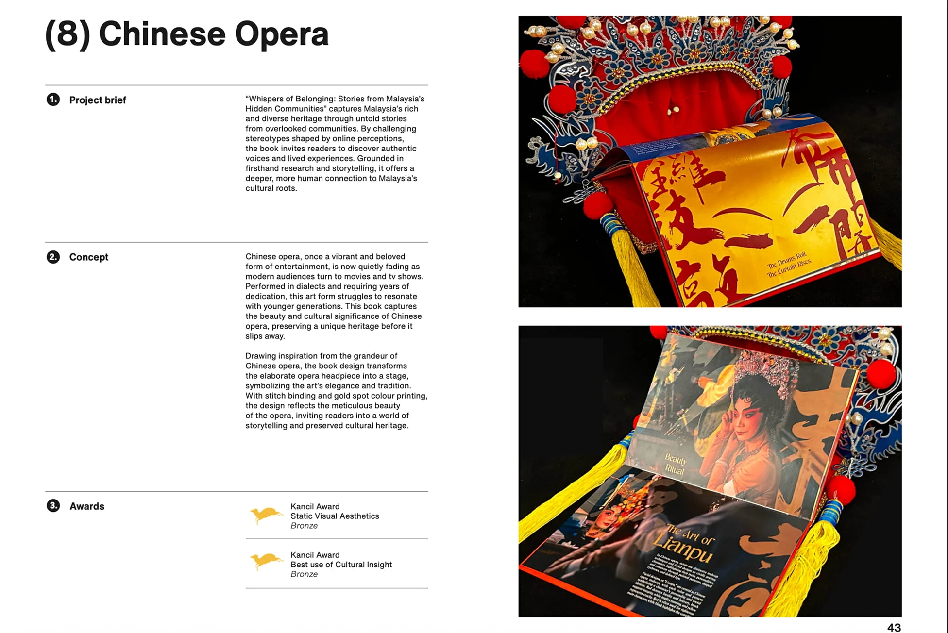

Credit to Ying. Further details can be shared upon request. 2022.
These projects explore how traditional cultural symbols can be translated into modern design experiences. The Chinese Opera publication reinterprets the intricate aesthetics of opera costumes and stage art through expressive layouts and tactile print elements, creating an editorial piece that celebrates cultural heritage. The Red Lantern packaging draws inspiration from the symbolism of Chinese New Year, transforming the lantern into a functional gift package that communicates festivity, prosperity, and warmth. Both projects aim to balance cultural storytelling with contemporary design thinking.
09
NightBinge
UX/UI Design
Features a "Neon-Noir" dark mode, high-contrast component library, and fluid gestural navigation, resulting in a premium, cinematic experience that reduces eye strain and keeps the focus entirely on the music.

Selected screens are shown due to client confidentiality. Further details can be shared upon request. 2022.
Designed the mobile UI for a start-up music streaming app, introducing a bold “Neon-Noir” visual style and gesture-driven navigation. The product launched successfully, attracting its first wave of early users and validating the app’s immersive listening experience.
09
NightBinge
UX/UI Design
Features a "Neon-Noir" dark mode, high-contrast component library, and fluid gestural navigation, resulting in a premium, cinematic experience that reduces eye strain and keeps the focus entirely on the music.
Selected screens are shown due to client confidentiality. Further details can be shared upon request. 2022.
Designed the mobile UI for a start-up music streaming app, introducing a bold “Neon-Noir” visual style and gesture-driven navigation. The product launched successfully, attracting its first wave of early users and validating the app’s immersive listening experience.
10
10
10
Design Highlights
These projects reflect my journey across different roles, from collaborating with teams on a range of design projects to working independently as a freelancer. Along the way, I’ve applied and refined the design skills developed during my art college studies, experimenting with creative solutions while strengthening my understanding of visual design principles. Working with talented designers and supportive mentors has also provided valuable professional insight and played an important role in shaping my approach to design.
Selected screens are shown due to client confidentiality. 2020-2023.
Harry is a UX/UI designer who builds intuitive, high-performing websites that not only look great but work hard for the business behind them. From research and wireframing to prototyping and polished UI, he shapes thoughtful, user-centred experiences from the ground up.
His real strength lies in connecting the dots between business goals and human needs, then turning that insight into practical, effective design. He works with a clear, structured process and a sharp eye for detail, always testing, refining and evolving through iteration and robust design systems to deliver work that’s both purposeful and beautifully executed.